Philadelphia Convention & Visitors Bureau
The Philadelphia Convention and Visitors Bureau (PHLCVB) was determined to help Philly regain its status in the spotlight following the global pandemic. In Spring 2022, 20nine collaborated with PHLCVB to develop an integrated campaign aimed at attracting corporate planners and international tourists to the city's intersection of culture, history and excitement.
Our team was tasked with revitalizing PHLCVB's previous "Meet Philadelphia" campaign, resulting in a new concept: "Meet Us in the Middle." It highlighted the city's rich history, brotherly love and opportunities for endless exploration. Initially intended for a limited run from March to June, the campaign's positive reception internally and externally led to its use throughout the entirety of 2022.
When 2023 rolled around, PHLCVB wanted to take their marketing efforts to a new level. 20nine introduced the campaign “Challenge the Expected,” incorporating a higher-end editorial look that embraced whitespace and incorporated a unifying tagline “Come for Philadelphia. Stay for Philly.”
Putting Philadelphia Back on the Map
Role
Art Director & Lead Designer
Created at 20nine 𝄪 2022–2023
Deliverables
Campaign Refresh Concept Pitches
Style Guides
Marketing Templates: Email, PPT Slides, Digital Banner Ads, Print Ads
Bus Wrap
Trade Show Booths
Team
Creative Director: Tracey Williamson
Copywriter: Matt Phillp & Greg Wikoff
Supporting Designers: Sophia Mairowitz, Liza Marino and Gianna DiAddezio
Photos courtesy of PHLCVB & affiliates
2022 Concept: Meet Us in the Middle
Philadelphia has played host to a myriad of globally resonant cultural moments since it became America’s birthplace. Centuries of vibrant culture and history provide the city with layers and layers of juxtaposed elements that hold the potential for an unlimited number of personal adventures.
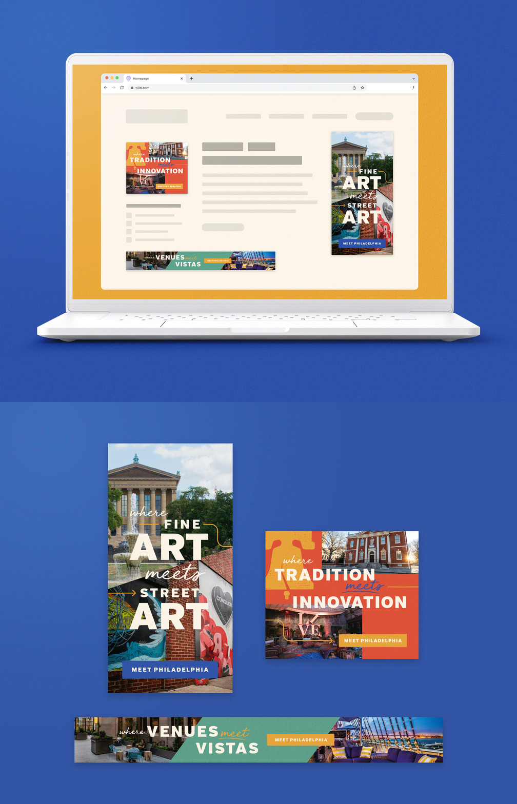
Our copywriter Matt Phillp developed a “Where X meets Y” headline format, setting the stage for endless combinations of text and image. I worked on curating the initial visuals, bringing together lively layers of type, photo and color inspired by Philly’s architecture, attractions and people. Simple, textured graphics provide a vintage, mercantile flare to more modern layouts — emphasizing Philly’s signature blend of old and new.
We provided PHLCVB with a style guide, graphic elements toolkit and a series of templates for their campaign roll out — single page print ads, email and digital banner ads. When special events came about, we produced other large-scale pieces such as bus wraps and trade show booths.
2023 Concept: Challenge the Expected
An event hosted in Philadelphia is unlike anything or anywhere else. Here, in one of the world’s most vibrant and eclectic cities, we put your guests' footsteps away from culture and history that go beyond just the founding fathers. We celebrate diversity and boast the infrastructure and venues to accommodate a thriving life sciences community and a passionate sports fanbase. Philadelphia is a place with so much to discover that it defies what a convention can truly be.
PHLCVB wanted a more flexible messaging structure after wearing out the previous year's version. Copywriter Greg Wikoff defined the parameters — a voice that was energetic but not wild, confident but never cocky, smart but not smart-ass. In 2023, the updated look retained some fonts and graphics from 2022, but with a significantly decluttered aesthetic. I utilized whitespace disrupted with gridded photography and established a restrained system with a two-color maximum assigned to each division/audience, avoiding a rainbow effect.
The more grown up look aimed to specifically attract meeting planners through targeted print and digital ads across PHLCVB’s divisions and audiences: Life Sciences, DEI, Sports, Trade Show and Corporate. We also developed a simple, dynamic series of email templates for easier drag and drop content placement.
Next Project: ASAP Magazine →


